D2C Challenges and the Competitive Environment: Tips to Create a Customer-Driven Shopify Website Experience
Over the past few years, a wave of D2C brands — including many digitally native brands — have captivated consumers and created a new landscape for e-commerce through engaging Shopify storefronts.
As more and more D2C brands have taken hold in the marketplace, websites with e-commerce functionality have become increasingly important and competitive. With the slew of Shopify and e-commerce brands available today, capturing your customer’s attention — and gaining their trust — is paramount.
Just like in the brick-and-mortar world, the customer comes first on e-commerce websites as well. But when you don’t have tangible facetime with potential customers, how do you win trust and create a customer-driven website experience?
Keep reading for our take on approaching the competitive D2C environment — and how you can create a customer-first digital presence from first click to checkout.
#1 Start strong
A website’s first impression is everything. Create an engaging homepage that invites anyone who lands on your site into the space — while simultaneously establishing your brand’s mission, voice, and a glimpse of products or services.
Although the age-old adage of “above the fold” is a consistent source of ongoing debate, there is some truth in hooking your customers at first glance. For many D2C & Shopify brands, this is where a compelling design — and a pithy headline! — come into play. Investing in high-quality branded product photography is one of the best ways to capture new customers.
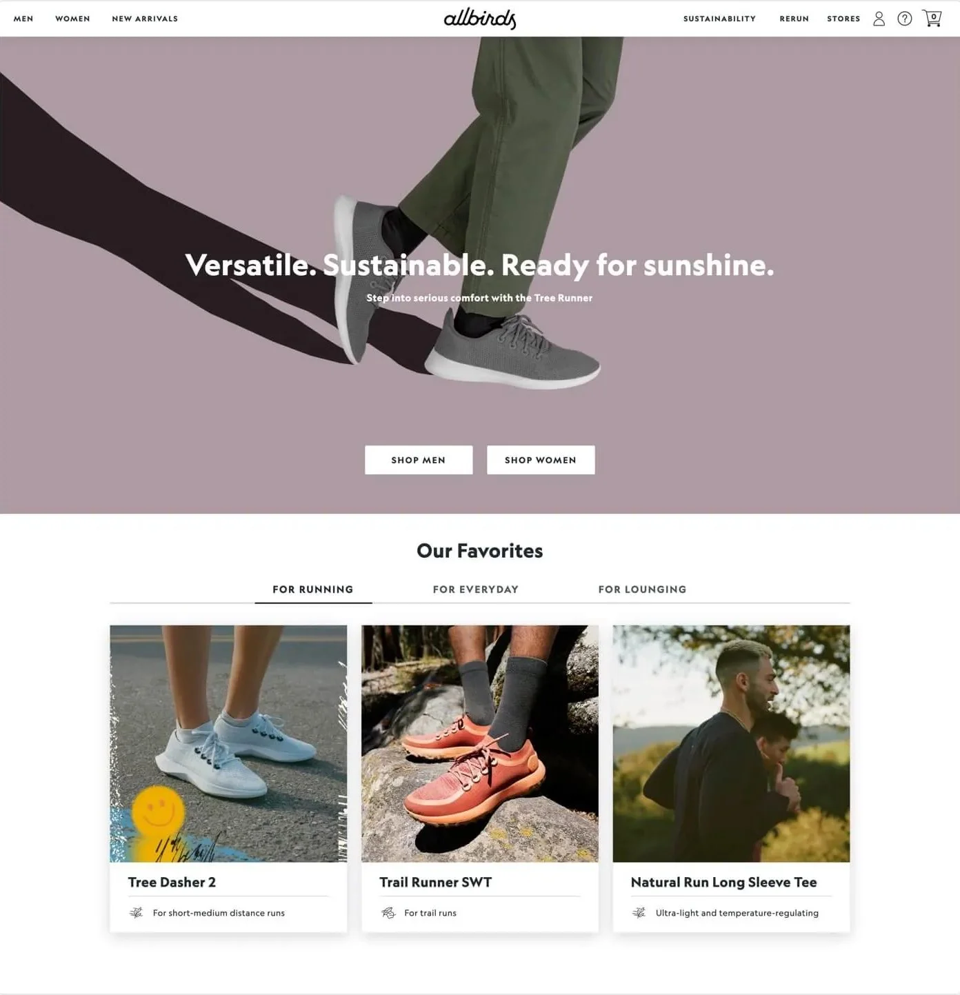
Using Allbirds as the perfect example, they pack a punch directly when a user lands on their website with an engaging product photo, catchy headline, and 2 direct call to actions for immediate engagement / a smooth userflow.
#2 Feature your products
Particularly for e-commerce brands — and those with Shopify websites — your products should take the spotlight. One of the best ways to present a positive user experience is to create an organized, streamlined product page to help shoppers find exactly what they need.
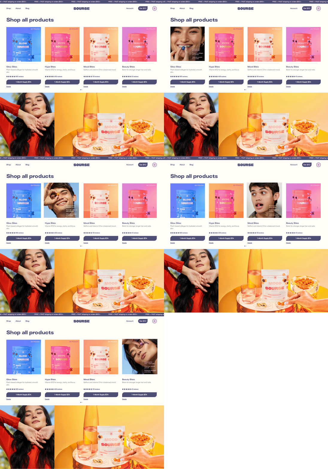
Photography and layout are crucial. Without an intuitively-organized layout — and high-quality imagery — customers may feel less intrigued to explore the products in more detail. Source does this extremely well.
For individual product pages, include a plethora of images for customers to swipe through or zoom in or out on. When a customer can’t easily touch your product in a store or ask an employee about the specifics, product photography is absolutely necessary.
Other important elements for each product page typically include an engaging product description (make sure it’s within your brand’s unique voice and tone!), any size charts or conversions as necessary, and recent product reviews (more on that later).
#3 Your story matters
Many e-commerce brands gloss over the importance of a brand story — but in a world that is increasingly digital, sharing the story of a brand is more important than ever before.
Build an “About Us” page for your e-commerce site that includes information about your mission, your vision, your values, and any other crucial components of what makes your brand unique.
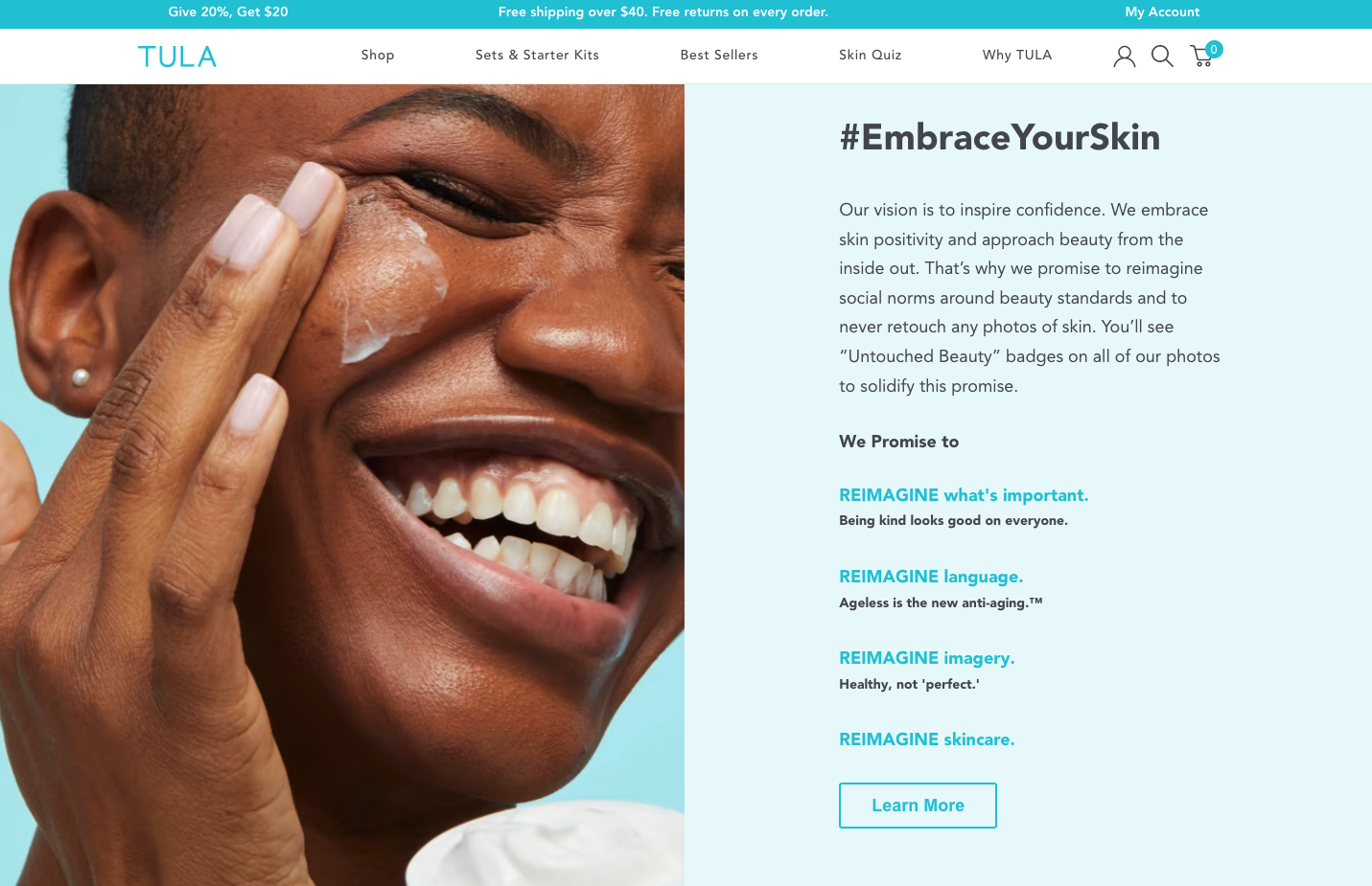
Using Tula as an example, they have an engaging “Why Tula” page dedicated to telling their unique story through a personalized message — hitting home with their core consumers to build brand love and trust.
#4 Show social proof
One of the best ways to create a customer-driven website experience and build trust is to show social proof.
Why? Because most online shoppers make purchasing decisions based on reviews and social content. Research finds that 71% of people are more likely to make a purchase based on social media referrals and 95% of shoppers read at least one review before making a purchase.
Plus, 63% of consumers said they’re more likely to purchase from a website with product ratings and reviews.
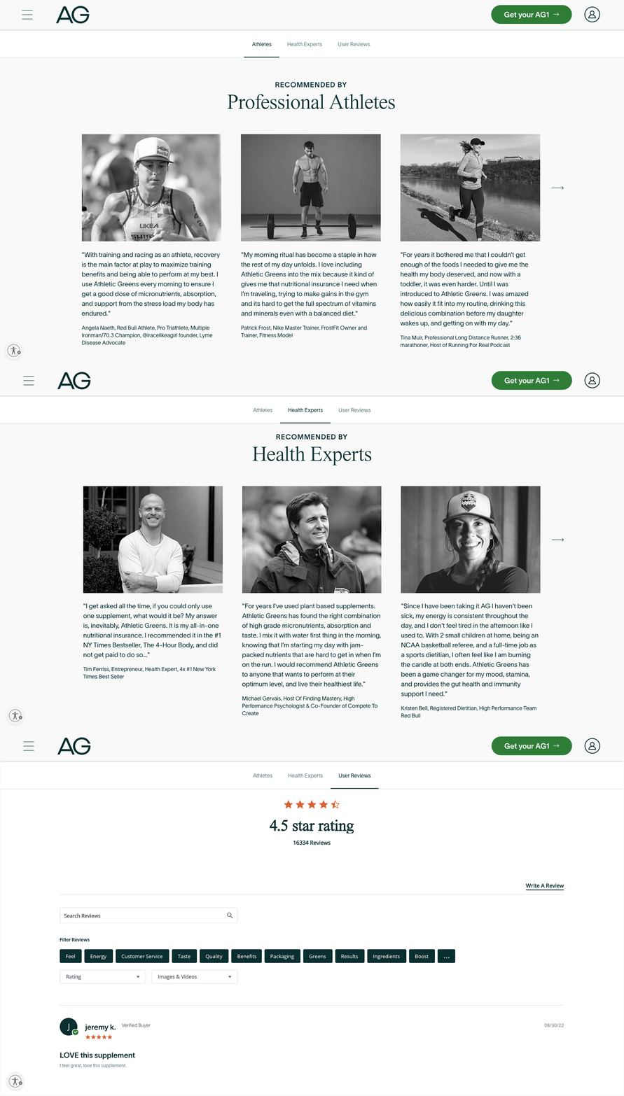
For Athletic Greens, they do an exceptional job in providing social proof in more than one area — touching on reviews from professional athletes, to health experts, as well as their consumers — all within a dedicated page on their site.
#5 Make the checkout process safe and secure.
Last but not least — your checkout process. If a checkout workflow is too complicated or glitchy, customers will bounce off your site and find a different vendor.
Your website’s checkout experience should always prioritize the customer’s convenience. This means a process that is efficient, streamlined, and straightforward — all key components in building trust and establishing your brand as one worth coming back to in the future.
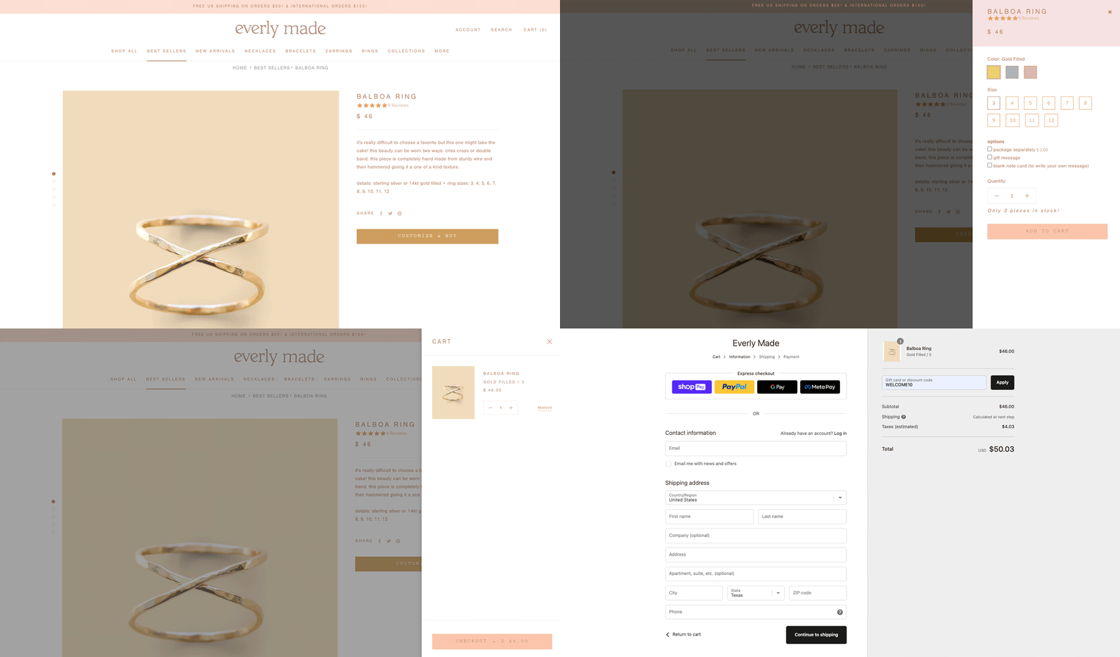
For Everly Made, they make their checkout process extremely simple with a few quick prompts. Given that many of their jewelry offerings are customly curated, they ensure they take their consumer through a seamless journey to customize their selected product, ending with a final checkout destination with ease.
Interested in Working Together?
Curious to know how Kona Made helps elevate the customer experience for D2C brands? Check out our list of website services—and be sure to reach out to us with any questions. We’d love to talk!

